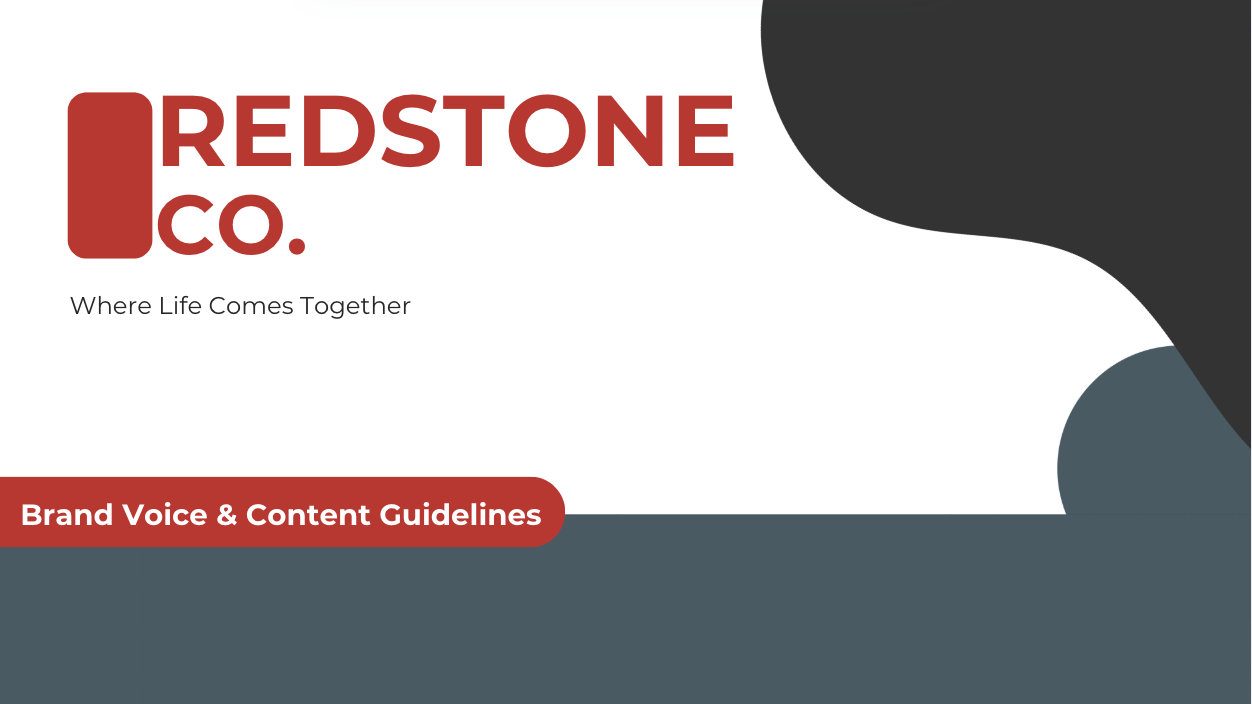
Redstone Co. | UX Copy, Brand Voice, and Content Strategy
Redstone Co. is a fictional national retailer I created to showcase how brand voice, UX writing, and digital strategy work together across platforms. Inspired by companies like Target, this spec project includes a full brand guide, e-commerce landing page, cart and checkout microcopy, and mobile app onboarding flow.
The voice is confident, helpful, and people-first. It was designed to support modern shoppers while aligning with corporate UX and content standards. Across each touchpoint, I focused on clarity, consistency, and conversion.
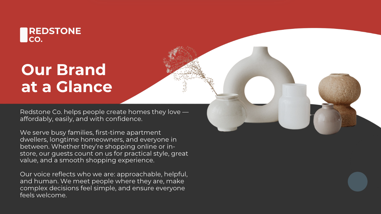
Brand Voice Guide
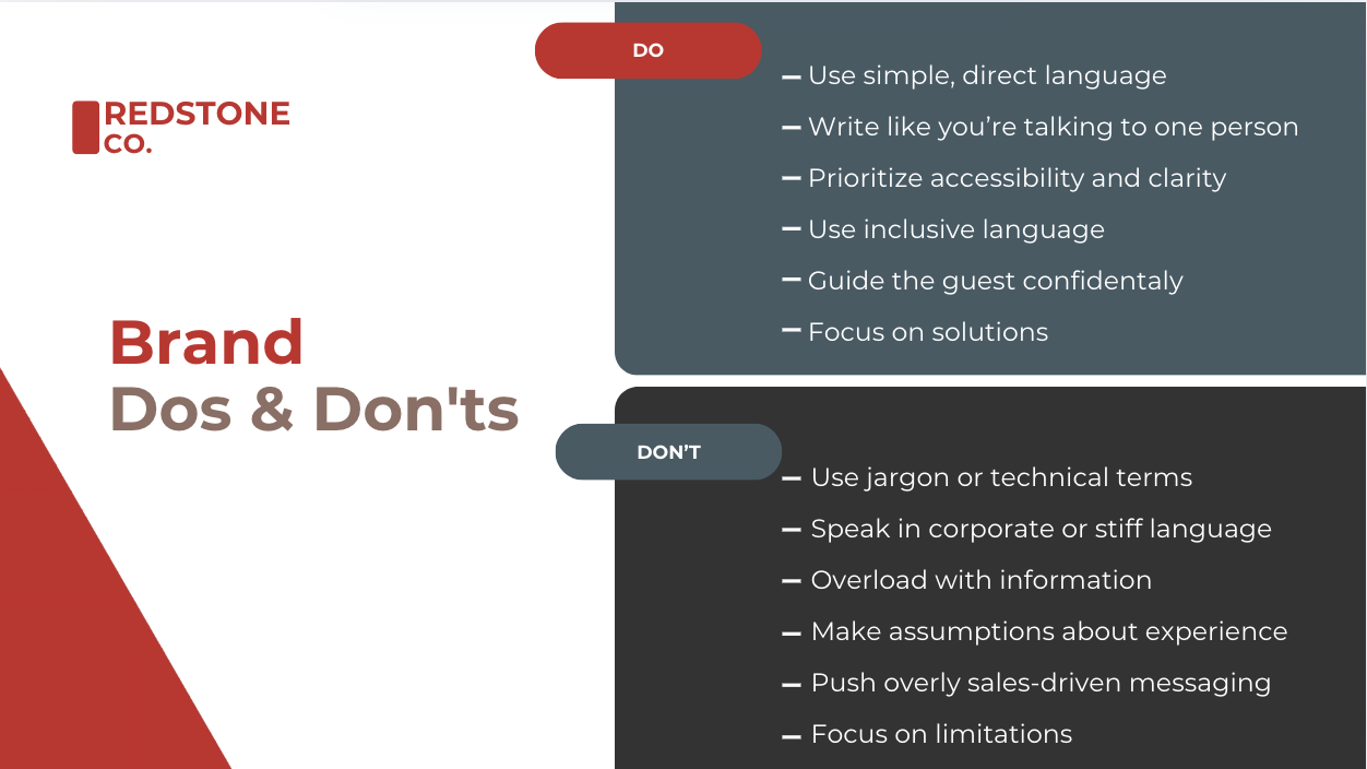
To showcase my brand-building skills, I created a full guide for Redstone Co.—a fictional retail brand inspired by Target. Designed for style-conscious millennials and Gen Z, the brand feels bold, elevated, and people-first.
The guide establishes a clear identity and cohesive voice across every touchpoint, balancing practicality with polish.
What I Did:
Defined brand personality with tone principles, voice keywords, and writing dos/don’ts
Balanced warmth and professionalism to reflect a large retail brand
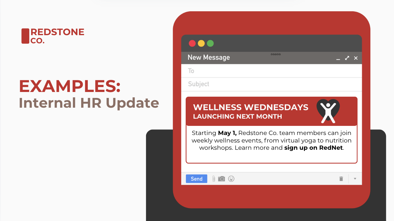
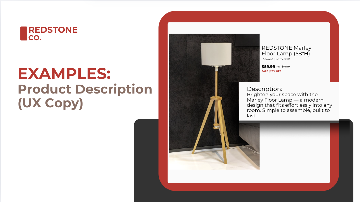
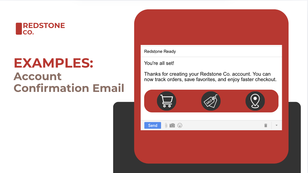
Created sample language for product descriptions, internal emails, and app copy


E-Commerce Experience
To demonstrate end-to-end UX writing for a retail brand, I created a full e-commerce experience for Redstone Co.—a fictional national retailer inspired by Target. From homepage to checkout, I wrote all customer-facing copy with an emphasis on clarity, tone, and ease of use.
The project centers around a seasonal Summer Refresh campaign designed to drive browsing and conversions. I structured the landing page to support intuitive product discovery and then rewrote the entire cart and checkout flow to reflect Redstone’s friendly, confident brand voice.
Highlights:
Named the Summer Refresh campaign to anchor the homepage
Wrote all UX and marketing copy for the landing page, including headlines, product blurbs, and CTAs
Rewrote every element of the checkout experience—from cart buttons to promo field labels—to improve clarity and reduce friction
Applied a consistent tone across the entire user journey, from browsing to purchase
Prioritized intuitive language that builds trust and supports seamless shopping
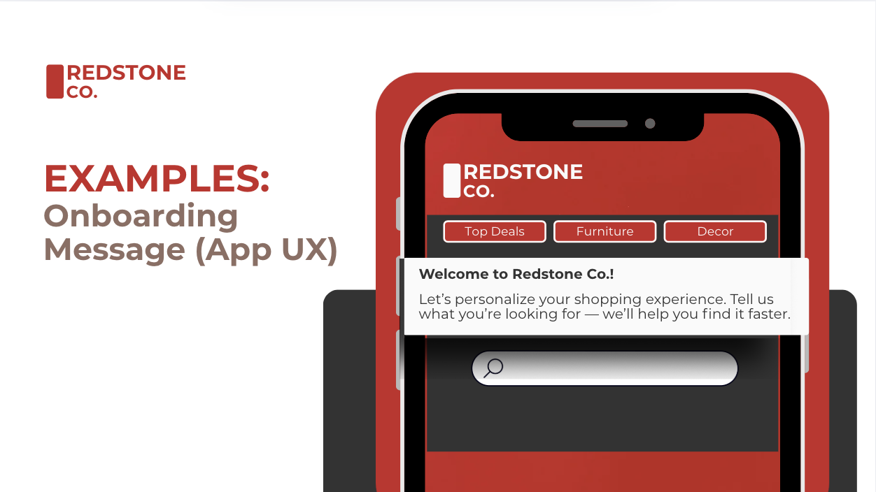
Mobile App Onboarding Screens
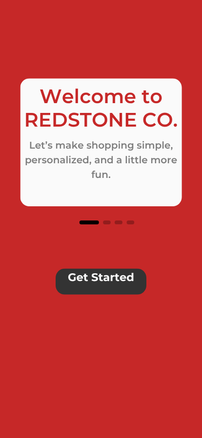
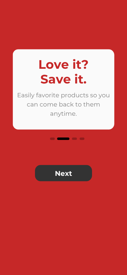

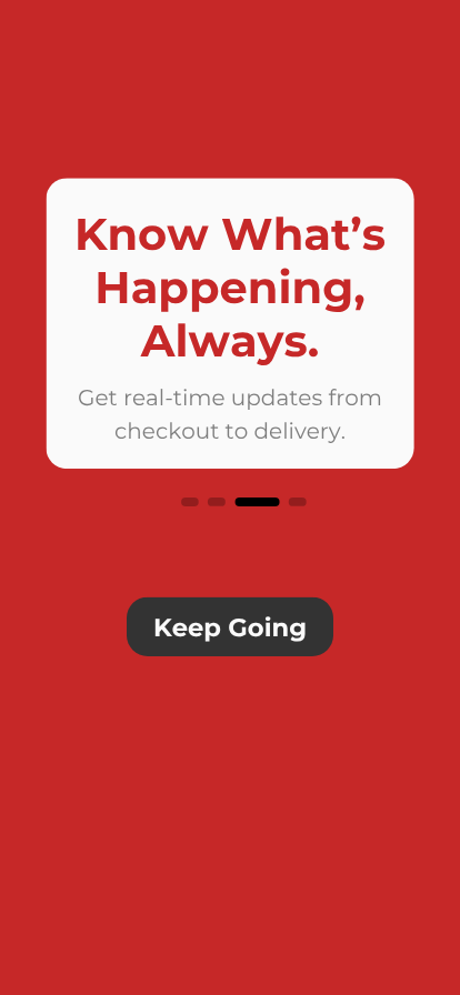
To round out the Redstone Co. digital experience, I designed onboarding screens for a fictional mobile app. The goal: create a welcoming, efficient intro that helps users understand the value of the app while reflecting the brand’s confident, people-first tone.
Each screen guides users through key features using short, encouraging copy and clear action prompts.
Highlights:
Wrote copy for a 4-step onboarding flow introducing app features and benefits
Balanced efficiency with warmth to avoid overwhelming first-time users
Used friendly, brand-aligned language to build trust and encourage engagement
Crafted CTA buttons that clearly signal what happens next
Reinforced Redstone’s positioning as a modern, helpful, style-focused retailer